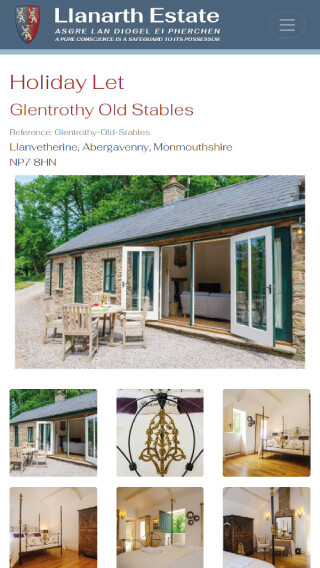
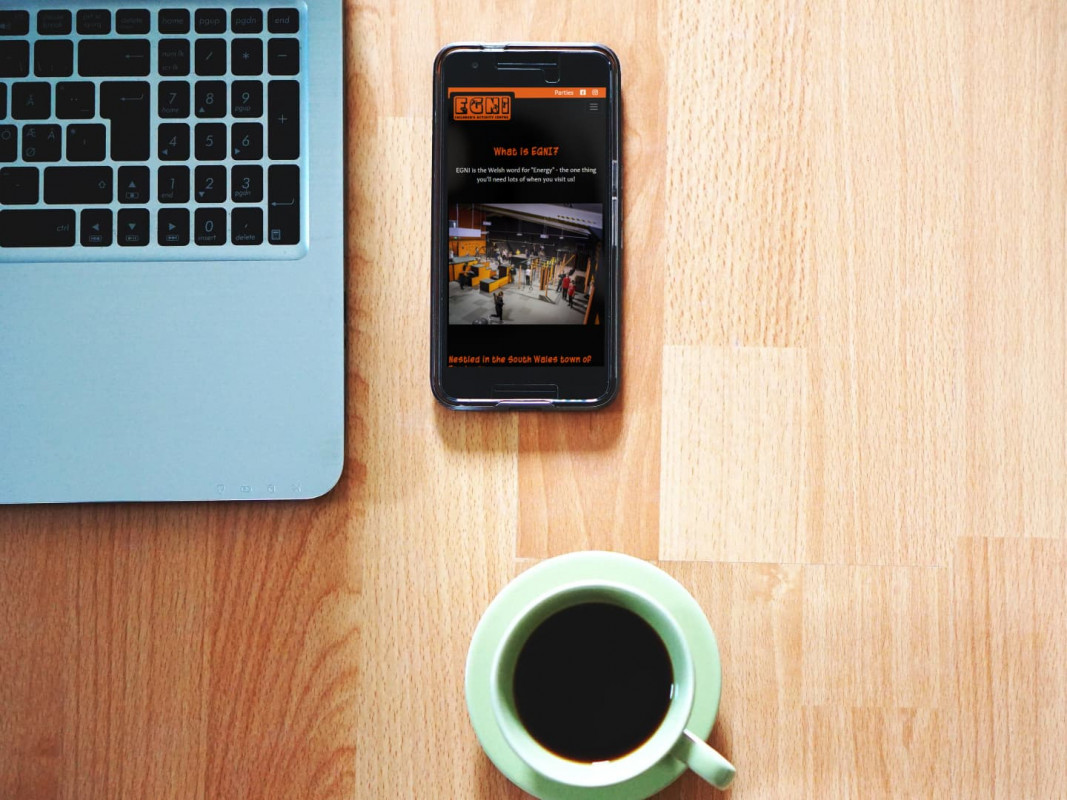
We understand that every business and every website has different needs. But that doesn't mean you should turn your back entirely on the hottest trends when it comes to web design. Whether you need an entirely new design, or you're just looking for a refresh, keep our current top trend in mind.
Make your website feel like an app

Your website visitors are always on the go and gone are the days where they sit down at a desktop and spend days looking for the solution you're providing.
These days, the answers they're looking for are either at their fingertips, or a voice search away. If your website is literally in the hands of your users, you need to be designing for mobile first.
But what does this look like in practice?
Leverage your whitespace
We know it can be tempting to cram as much as you can on to your website and really try to show off what you can do. But sometimes it's just too much information.
If your website is full of amazing content and images, animations and videos, think about whether your user is getting distracted.
You need your user to be able to complete an action on your website, whether it's filling out a contact form or buying your product. If your website is too full of information, will the user know what they're meant to be doing?
Leveraging your whitespace can allow the user to identify what they're meant to be doing on your website, making your call to action (CTA) more obvious, meaning they're more likely to do what you want them to.
Create a better navigation experience
Have you ever been on your phone, browsing a website and thinking, "I can't click anything, it's too small"? This is where some websites fall down.
On the desktop version of the website, the navigation is probably fine and perfectly usable. But it doesn't translate to mobile.
You need to ensure that your navigation is both easy to understand and easy to use. Whether that means making the text bigger, or adding more whitespace around it so it's easier to click the right thing.
After all, if the user goes to the wrong page because they accidentally clicked the wrong link on a crowded navigation, it detracts from the user experience and might mean they leave the site entirely.
Think about horizontal scrolling

This might not be a tip that works for everyone, so use it with caution.
Think about the shopping websites you've been on recently, where there are multiple images of the same product, like clothes, where they show you front, back, sides, close-ups etc.
Did you have to click on every one of those images individually to see it? Or could you scroll horizontally through them?
This isn't something new that's only just been developed and we've been using it in our client's websites, in places in like galleries, for years. But as the trend for having a website that works more like an app is growing, it's something we're seeing more and more of.
Make your footers useful
Most people don't give much thought to their footers. They're a place to have terms and conditions, copyright notices and other links that don't really fit in with the design of the site. But one thing we're seeing more and more of are useful footers.
These footers basically mirror the top of the site, so once your user has scrolled to the bottom of your content, they don't have to go all the way back to the top to find your navigation again.
Top Tips For This Year
If you're not sure what your website should look like this year, just make sure of one thing. Make sure it's easy to use wherever your audience are using it.
Whether that means minimising the content you have so it's easier to view on mobile, or making sure it looks visually spectacular to delight your audience, we're here to help.
Whether your existing website needs a refresh, or you want to start completely from scratch, we can help you make your ideas become a reality.


